Video Killed the Radio Star
A real-time video dashboard that developers love
Project Management | Art Direction | Wireframing | System Design | Interaction Design | UI Design | Data Visualization
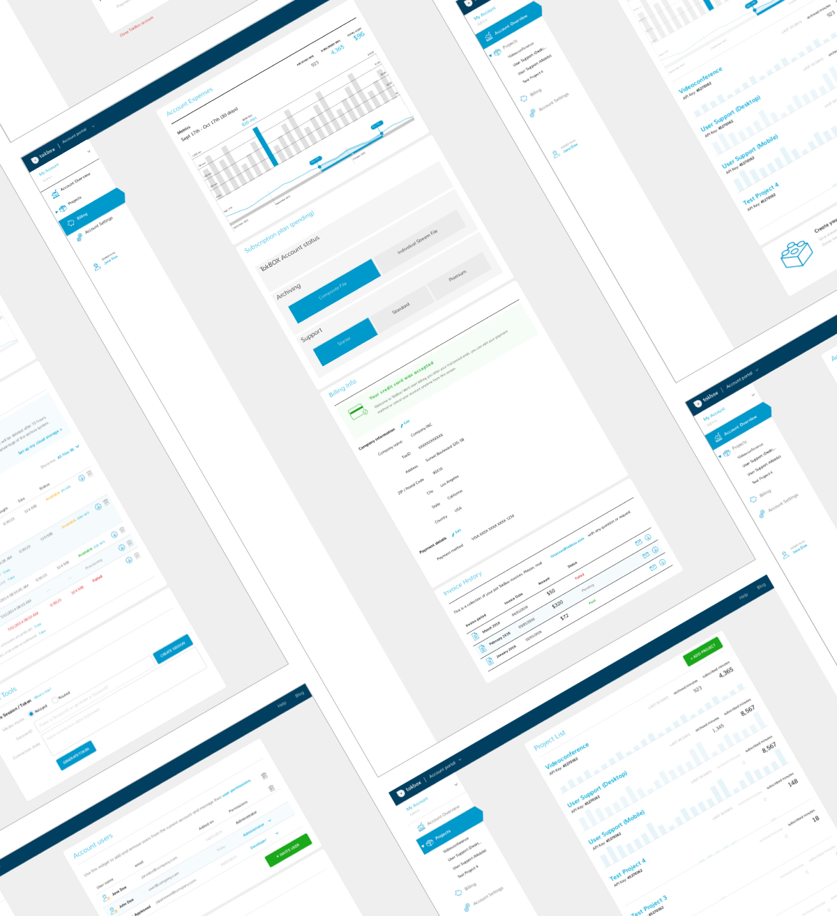
Project goal: launch a comprehensive dashboard for TokBox users to be able to create, configure, and manage their live video projects.
Process: ESTABLISH the target audience -> IDENTIFY core jobs to be done & EVALUATE the competitors -> MAP the user's journey -> CONSTRUCT the ideal user flow -> LAY OUT components for balance & focus -> EXPLORE & HONE visual theme -> CRAFT the UI components
ESTABLISHING the Target Audience
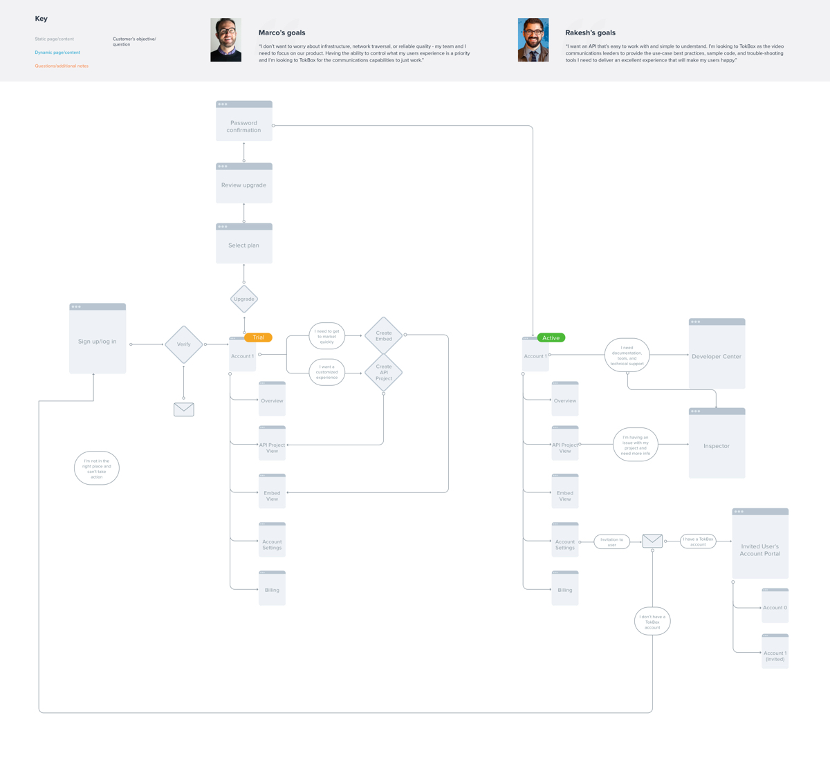
Designing a comprehensive dashboard for a video API platform means knowing what jobs developers are trying get done and what problems they need to solve throughout their journey. Through in-depth user research, we identified two core builder personas, Marco (the Expert) and Rakesh (the Newbie) and built UX and product requirements around their needs.
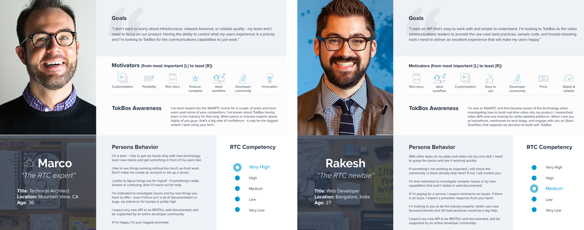
The two builder personas: Marco (left, the Expert) cares about maximum flexibilty, feature richness, and excellent documentation. Rakesh (right, the Newbie) cares about ease of use, an involved developer community, and ready-to-go components.
IDENTIFYING Jobs-to-be-Done & EVALUATING the Competition
A dashboard that provides configuration and management capabilities to our users requires contribution from and alignment across each department in the organization (cue Finance, Business Analytics, Support, Product, Engineering, Management, and UX all raising their hands at the same time). As part of discovery and requirements gathering, representatives from each department who would either be part of the core execution team or stakeholders rallied in a room for 3 days to align around the goal, target audience, V1 must-haves, and initial journey.
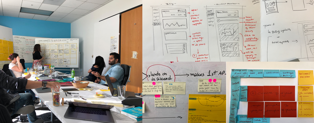
Ideating and aligning before project kickoff. Plus, some initial sketches to come out of that session.
Researching both direct and indirect competitors' approaches to customer dashboards.
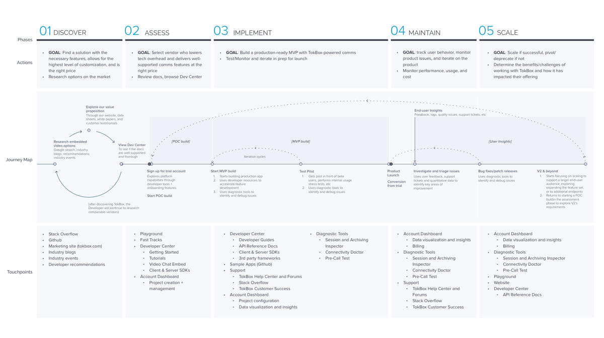
MAPPING the User's Journey
As part of the user research, we built a customer journey map that dug into the actions taken and milestones throughout each phase of the journey (Discover, Assess, Implement, Maintain, Scale) and where in our ecosystem users are engaging.
CONSTRUCTING the ideal user flow
Pairing insights from the user research with the ideation workshop decisions provided a solid foundation for constructing user flows that we were able to test with 6 testers whose characteristics mapped well to the two builder personas. One of the tests we had them perform was a card sorting exercise, which helped refine both the end-to-end dashboard flows as well as the navigation structure.
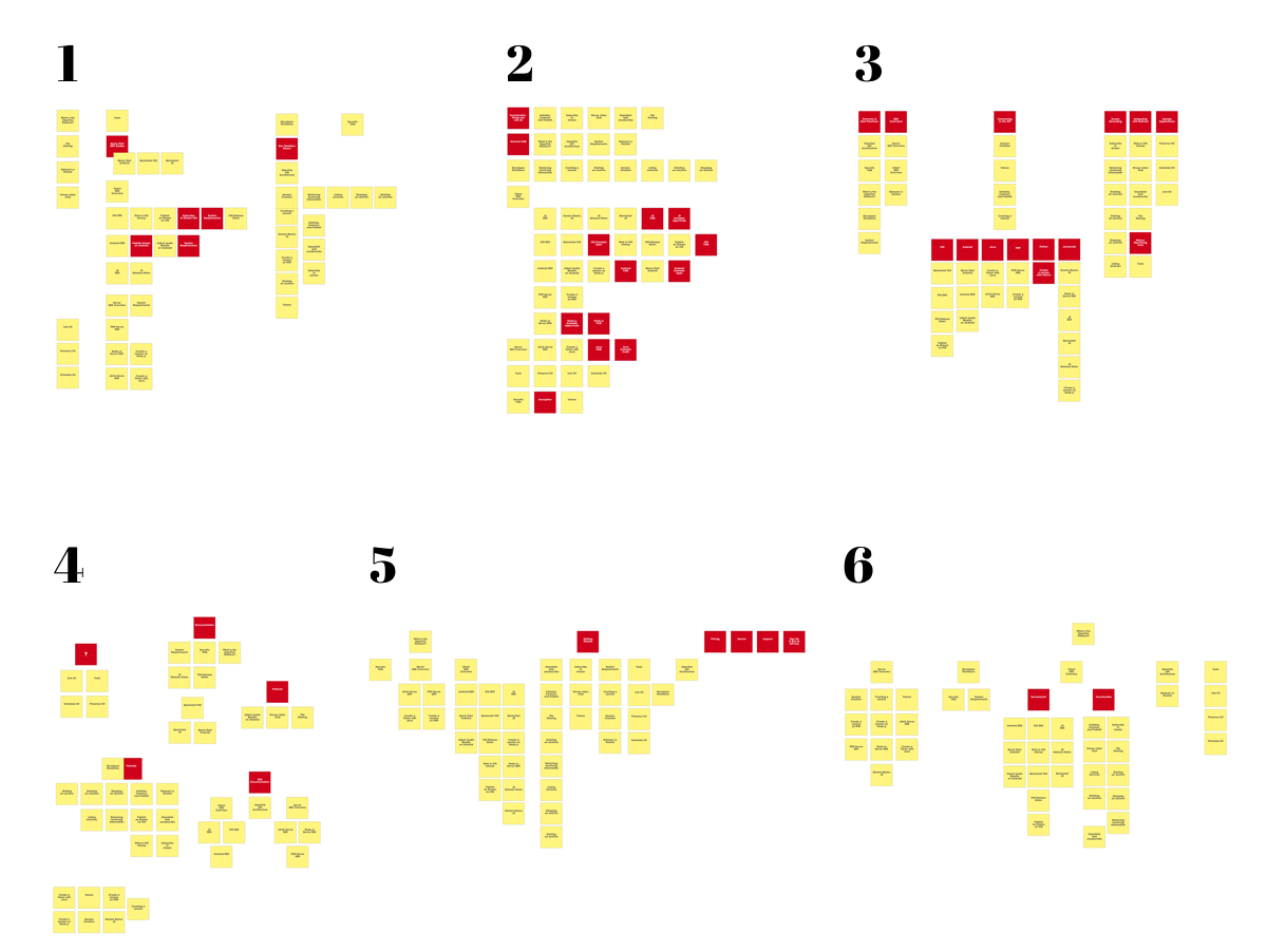
Results from the developer card sorting exercise - 3 "Rakeshs" and 3 "Marcos" grouped like terms, all of which would either be categories in the dashboard navigation or modules on interior pages. The areas highlighted in red represent different information architecture approaches.
LAYING OUT Components for Balance & Focus
The design principles that inspired the initial layouts were to provide focus for users who would be consuming quite a bit of data, running tests on their code, or evaluating their account settings and billing. Having an uncluttered yet bold experience would encourage dedicated attention with easy access to information or separate pages that would aid in the task at hand.
EXPLORING & HONING the Visual Theme
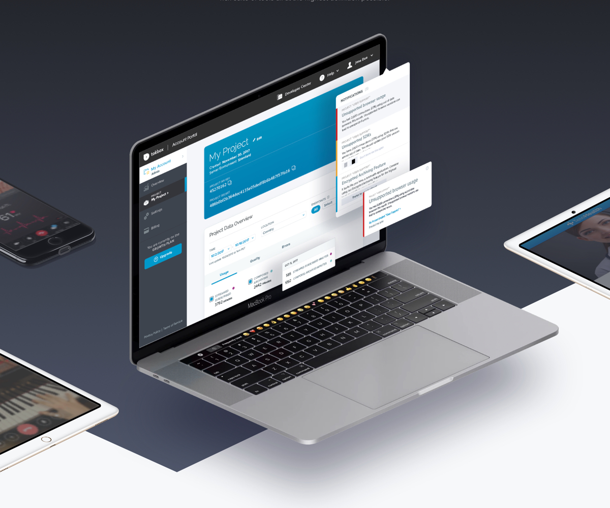
With the earlier established design principles in mind, the high-fidelity explorations pulled in brand considerations as well as inspiration from competitive examples. The result is a bold, clean, and friendly interface that improved developer's ability to configure and manage their TokBox accounts without friction or frustration.
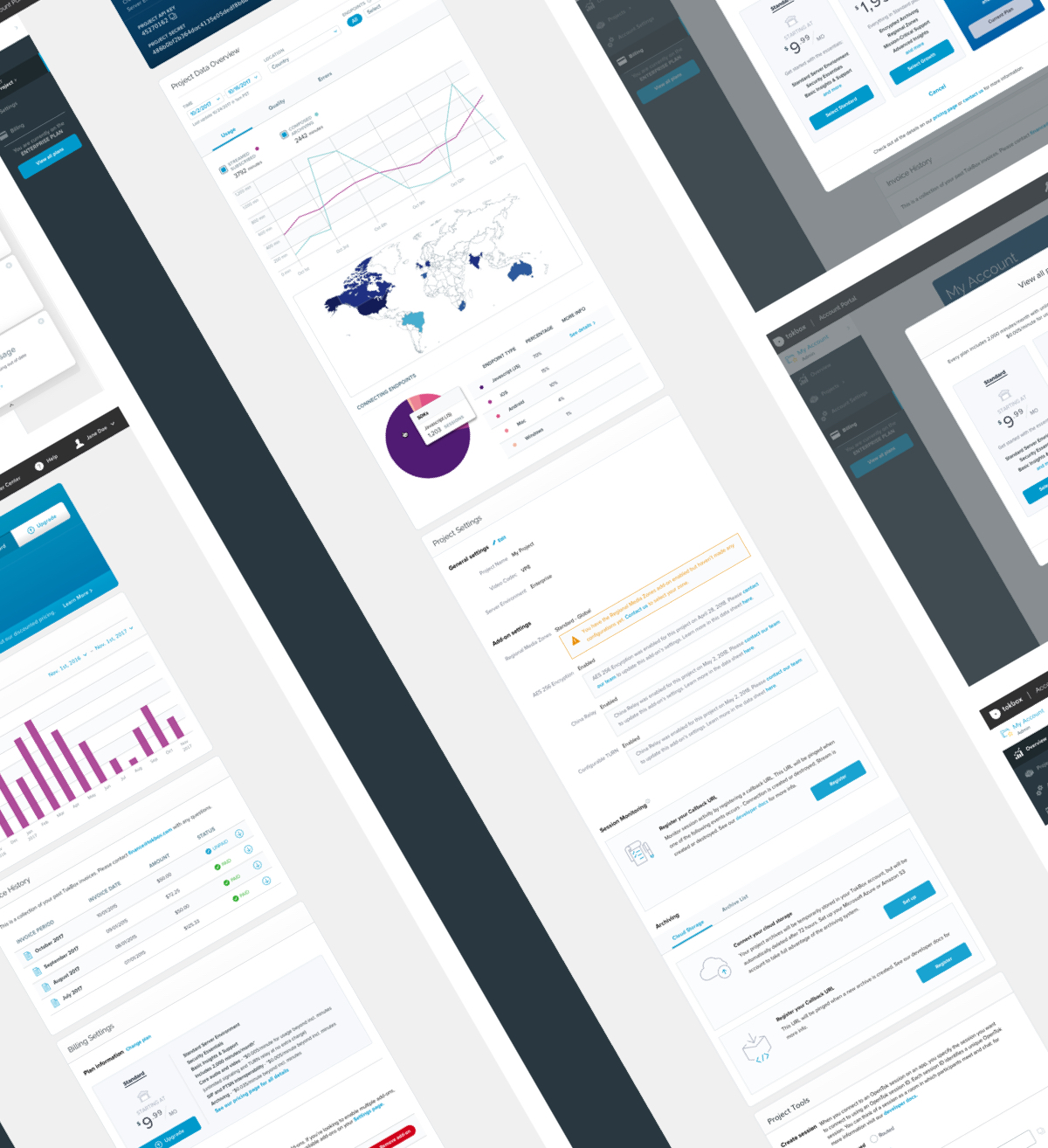
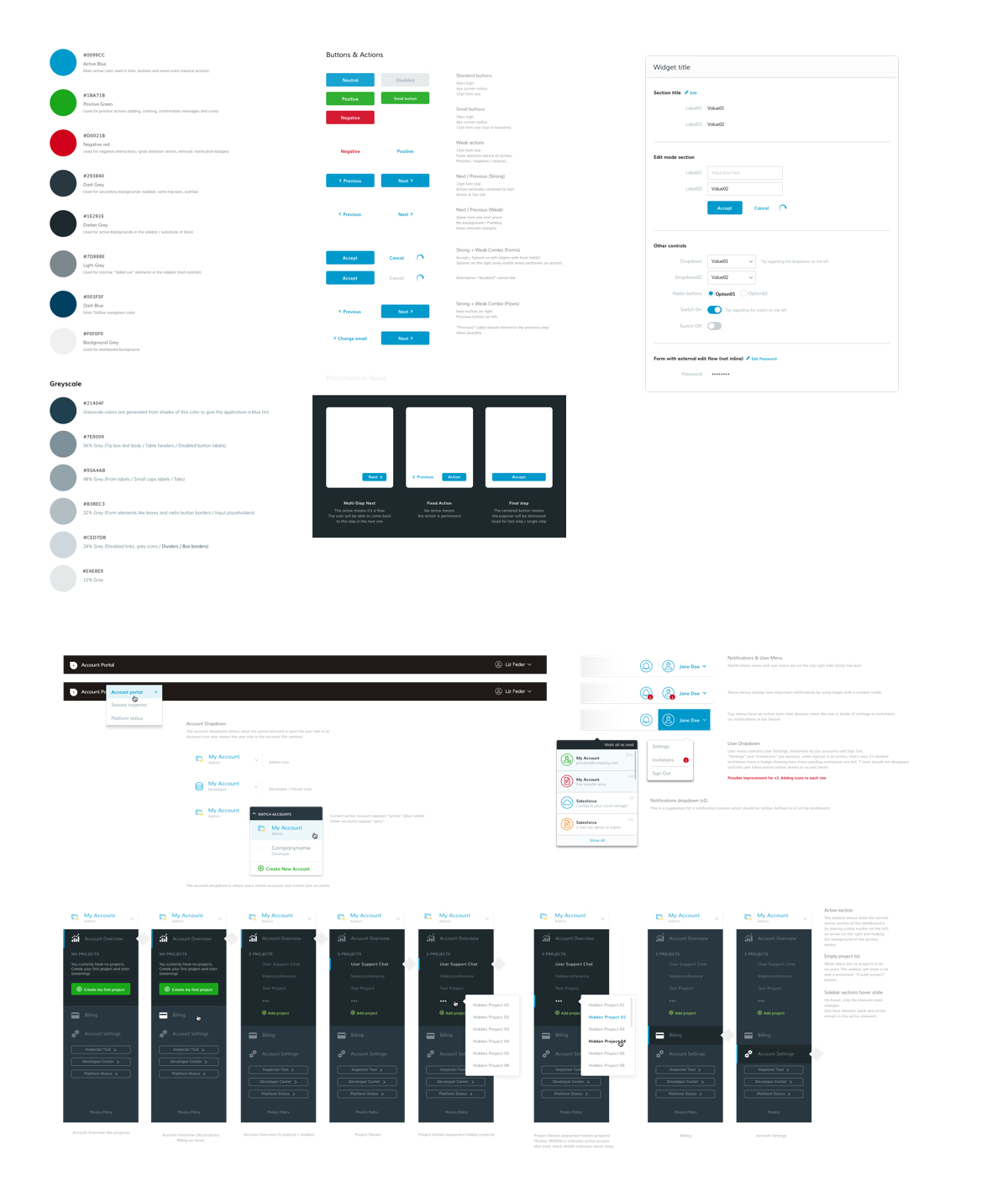
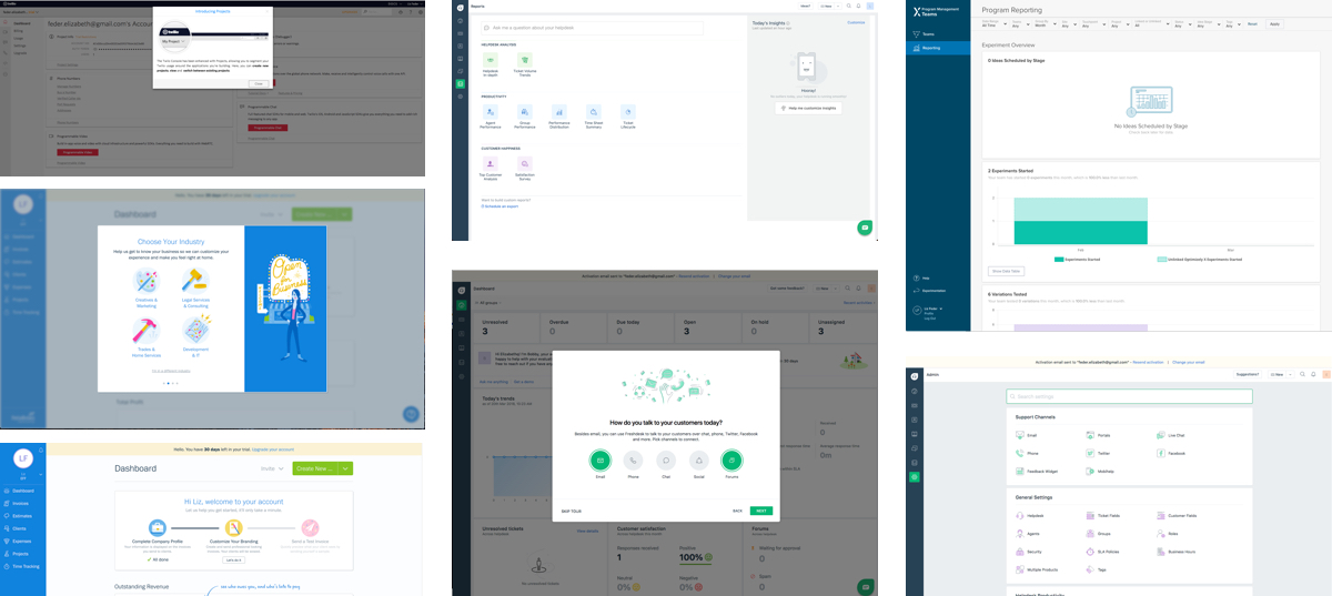
CRAFTING the UI Components
With the visual language established, it was critical to build out a robust system of UI components and use-case informed modules. This not only codified the newly-defined UI and interaction systems but also allowed for greater consistency across other developer touchpoints (like tools) in the ecosystem and laid the foundation for coding up a pattern library to accelerate future design and development.