The new TokBox logo
Strategy & Planning | Art Direction | User Research | Brand Design | Brand Management | System Design | UI Design

Spoiler alert
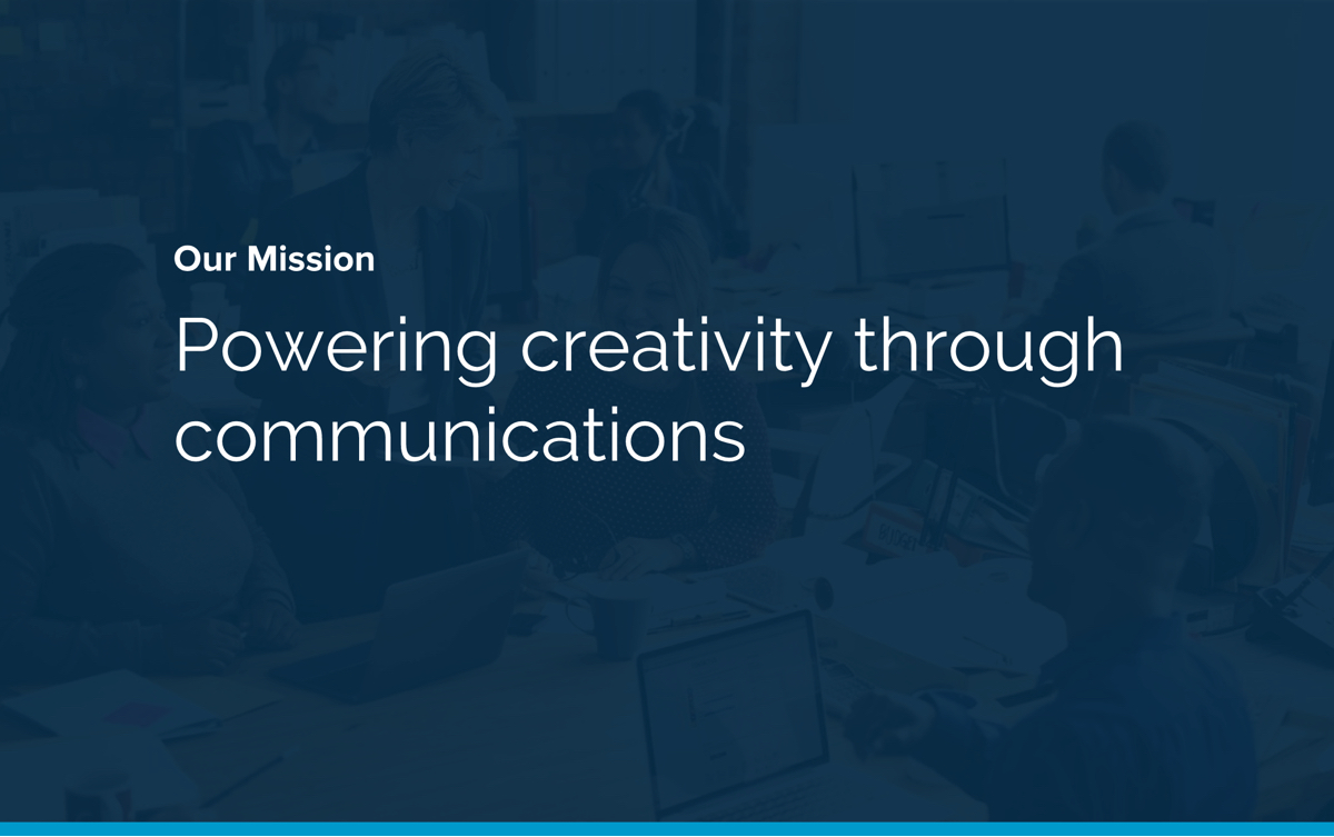
Project goal: Position and differentiate TokBox as the go-to live video platform provider in market.
Process: UNDERSTAND the history -> ESTABLISH the target audience -> PINPOINT the problem -> DIG into the data -> EVALUATE the competitors -> AUDIT the current identity -> DETERMINE company personality, objectives, and values -> CRAFT the mission -> EXPLORE visual themes -> BUILD the brand guide and execute across touchpoints
The new TokBox logo
TokBox originally started in 2007 as a Skype competitor but pivoted in 2010 to focus on providing a developer platform for building live video. By 2015, TokBox led the Video API market with a platform that delivered high-quality video chat that experienced developers could build across any device. UX pushes to prioritize Developer Experience as a priority goal to properly focus on the developer audience - without their success, TokBox cannot succeed By 2017, annual revenue and MAUs have tripled but that success hinged almost entirely on video -time to focus back on our roots
Evolution of the TokBox logo over 10 years
Following two quarters of customer research and persona development and validation, we identified 4 key personas (2 buyers and 2 builders) that TokBox management adopted and socialized within their respective teams.
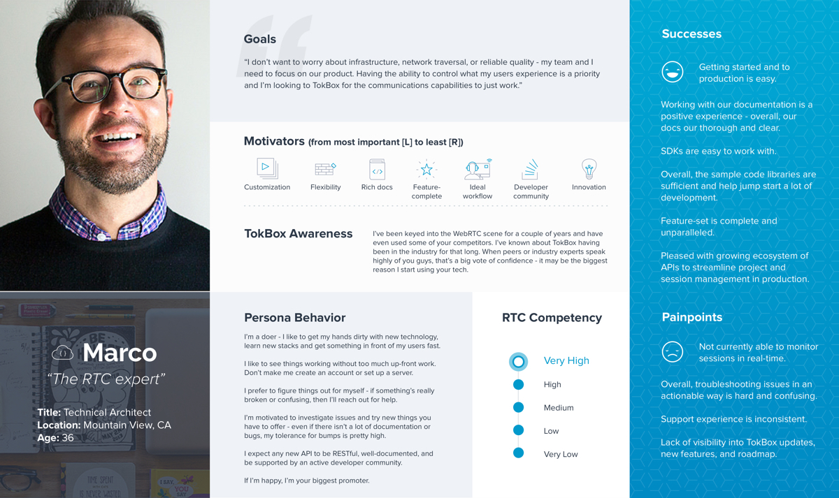
Marco, the lead engineer and WebRTC expert, is one of 4 personas identified as representing the TokBox customer base
Through internal data analysis and customer research, we discovered low brand recognition amongst our builders, and when developers or potential customers did know about us, they often got our name wrong (OpenTok, Tok, etc) - facepalm. And since a lot of discovery was organic and reliant on industry recommendations, knowing who we are is critical to the success of the business.
So, how do you measure brand awareness? There are many metrics we monitor, but these were the ones singled out:
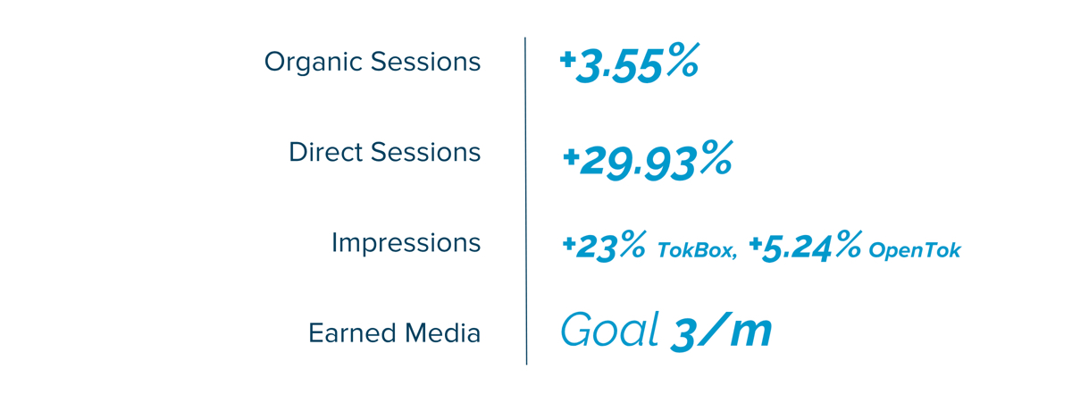
Organic Sessions: originates with search-engine results (i.e. someone uses Google to search for warmest down jacket, a link to your website appears in the results and that person clicks the link to visit your site). Direct Sessions: visitors who come directly to your site by entering the site URL in their browsers or by using bookmarks to your site. Impressions: an impression is counted each time your ad is served on Google's ad networks to your target audience. June '16 to June '17 we saw impressions increase 23% for Tokbox, 5.24% for OpenTok, [TokBox - ‘16=5345,‘17=6579; OpenTok - ‘16=3052, ‘17=3212]. Earned Media: publicity gained through promotional efforts (ie. TechCrunch article).
The TokBox logo isn't a big standout from competitors. The lowercase name is usually associated with startups and conveys a more casual personality. Blue is very popular and is used as a primary color by three other direct competitors. The geometry is simple and used by several other brands, especially in technology. The simplicity of the logo makes it easy to duplicate and further dilutes uniqueness. The mark can also be interpreted in different ways but definitely not as something video-related company. However, the logo CAN be interpreted as a chat bubble, which indicates communication/conversation.
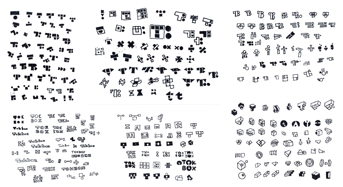
We surveyed TokBox executives, managers, and individual contributors about fundamental brand traits like mission, value, and personality. From there, we hosted a workshop with key stakeholders on mind mapping from the results and building personality spectrums based on employee contributions. These findings inspired a series of preliminary sketches.
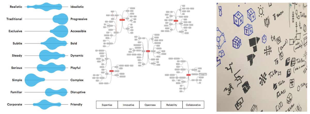
Left: personality spectrum results. Center: mind map based on emerging brand pillars. Right: initial inspiration sketches
Based on the output of the workshop, our CEO crafted a mission that was excitedly adopted by management. From there, we were off to the races - gaining traction around the concept of building blocks and quickly developing and testing variations on that theme.
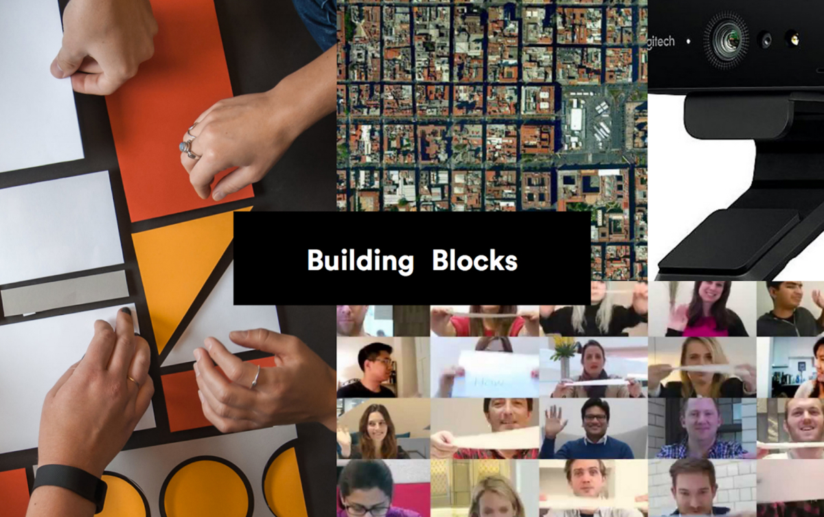
The concept is classic and foundational: TokBox offers the building blocks that helps companies create their own communications systems. Polygons represent systems and services while circles represent people and users - all coming together in one balanced mark. The geometries convey a stable structure but with a playful tone. They can also extend beyond the mark and can expand to other assets to tie the visual system together.
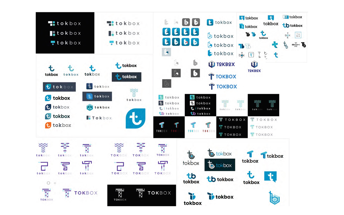
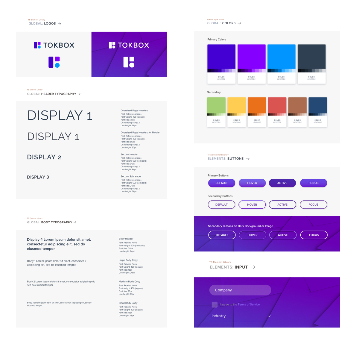
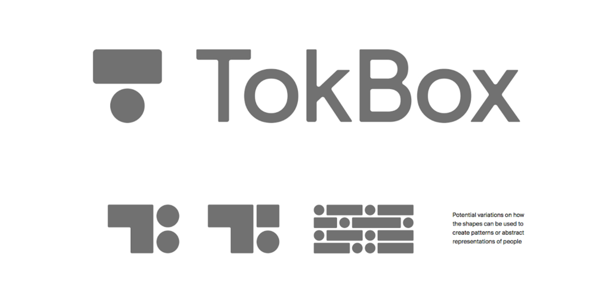
3 months after kicking off discovery, the new TokBox brand identity was enthusiastically shared with the organization. The new mark includes a logotype comprised of uppercase, yet rounded, letters, complementing the geometry of the mark. The rounded corners softens the graphic strength of all caps and presents a more friendly and approachable brand.
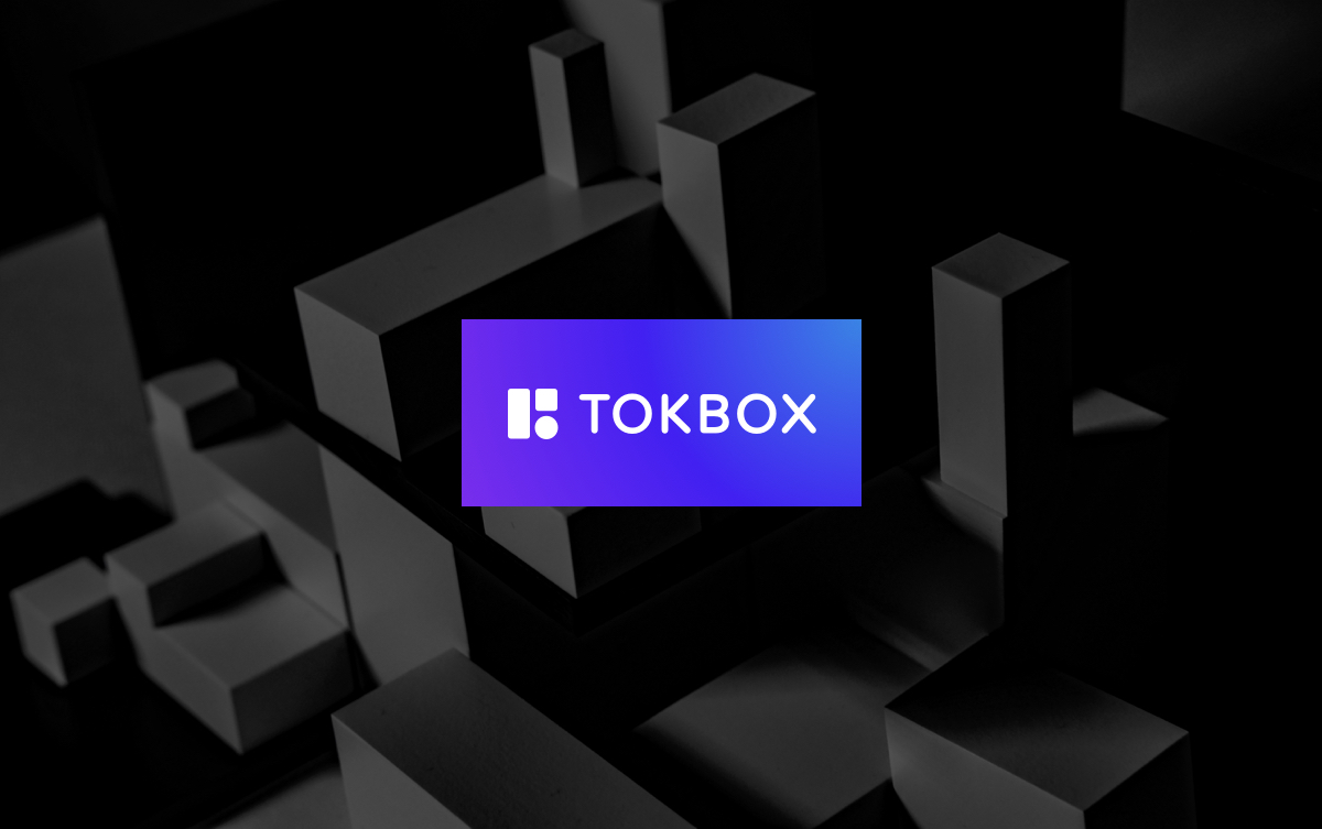
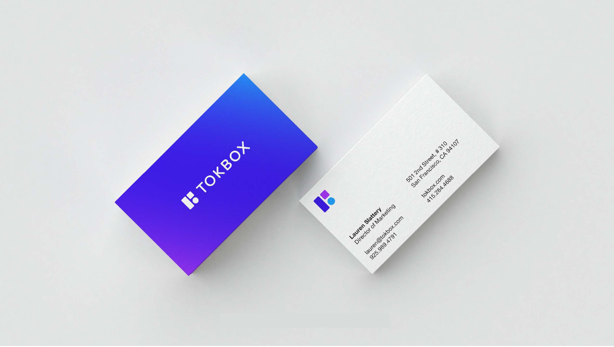
The TokBox logo focuses on balance and support - each block is unique (The ‘platform’ spine, a hue between purple and blue acting as a bridge between the user and the service, geometrically connecting the user (circle) and the service (square) and its respective hue, represents the different elements; user, service and platform. The composition of all three shapes together create a whole that’s greater than the sum of its parts: if one shape is removed, the balance is broken and the whole could collapse.
Primary hues are purple, not currently used by direct competitors, and reflect a unique brand that stands apart. The touch of blue nods to the previous identity: the total palette works in concert without giving too much prominence to any one color. The logotype is a dark, desaturated and refined blue that acts as a complement to the more vibrant building blocks. Each block, and its respective hue, represents the different elements; user, service and platform. The composition of all three shapes together create a whole that’s greater than the sum of its parts: if one shape is removed, the balance is broken and the whole could collapse.
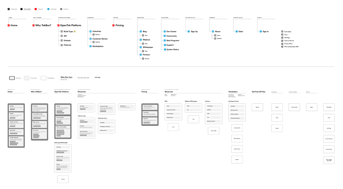
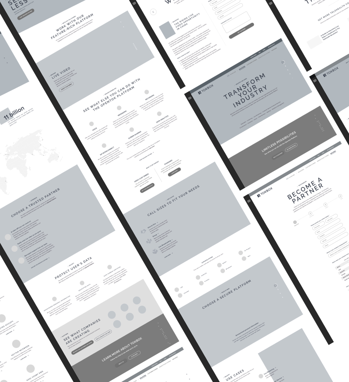
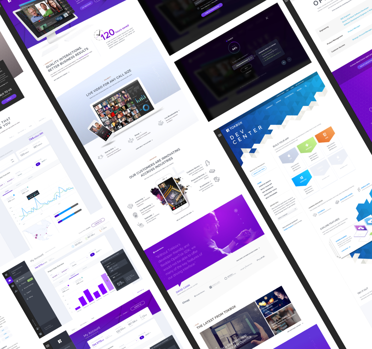
New site map structure of tokbox.com
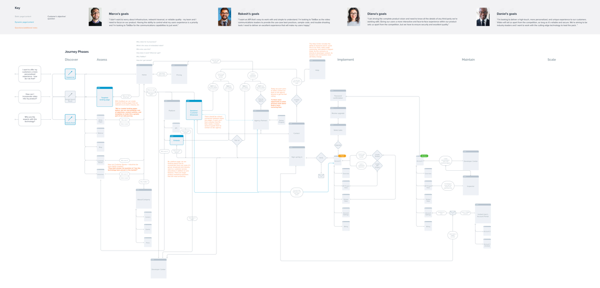
User flow for the new tokbox.com